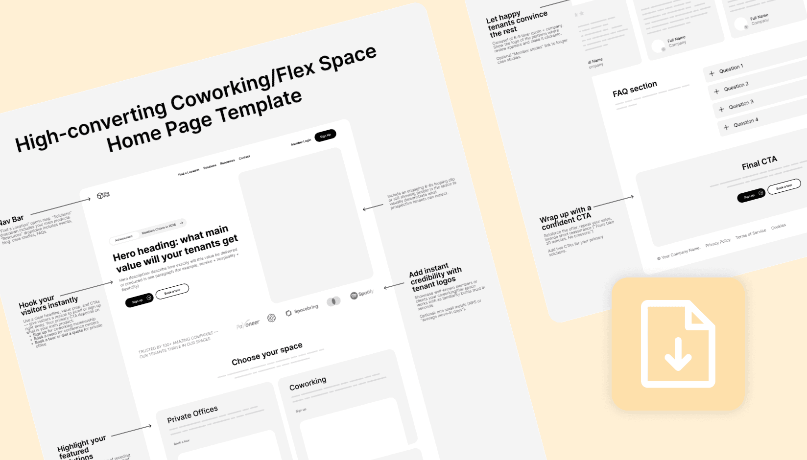
If you’re opening a coworking or flex space, your first website has one job: turn strangers into tours, meeting‑room bookings, day‑pass sales, and qualified leads—weeks or months before your doors open. Most early sites don’t do that. They read like a brochure, hide the next step, and make people email for simple things like booking a room.
The simple pattern that high-performing sites follow
After reviewing more than two hundred coworking space websites on four continents, the pattern is clear: the sites that perform are simple, predictable, and fast. They put customer intent front and center, make purchasing obvious, and treat each location page like its own landing page.
This article distills those patterns into a single, plain‑English blueprint you can copy. It’s designed to rank and to convert: roughly two thousand words, short paragraphs, and question‑based subheads so search engines and AI overviews can understand the structure.
At the end, grab the free one‑page PDF template you can hand to your designer and developer, or website development agency for implementation.
Download the template
Start with the moment of truth
The first five seconds decide whether someone stays. A good coworking space website doesn’t start with a manifesto; it starts with solutions. Let people pick their intent—Office, Coworking, Meeting Room, Event Space, or Virtual Office in a relevant dropdown of your navbar using a WYSIWYG HTML editor.
This single pattern cuts through guesswork. If I’m planning a client meeting, I choose Meeting Room, enter a date, and expect to see availability. If I’m considering an office, I expect to schedule a tour. That clarity reduces pogo‑sticking and puts the right path in motion immediately.
Pair the navbar with a hero section. The headline should explain what value prospective tenants will get, while the description summarizes how exactly it will be delivered.
Add two obvious CTAs on the hero for your top products. For example, one for Book a Tour (for office buyers), and another for Book/Buy Now (for rooms and day passes). The reason is simple: not all prospects want to talk first. Many want to transact and be done. Meeting rooms and day passes are impulse‑friendly. Offices and suites are consultative. Give each buyer the path they expect.
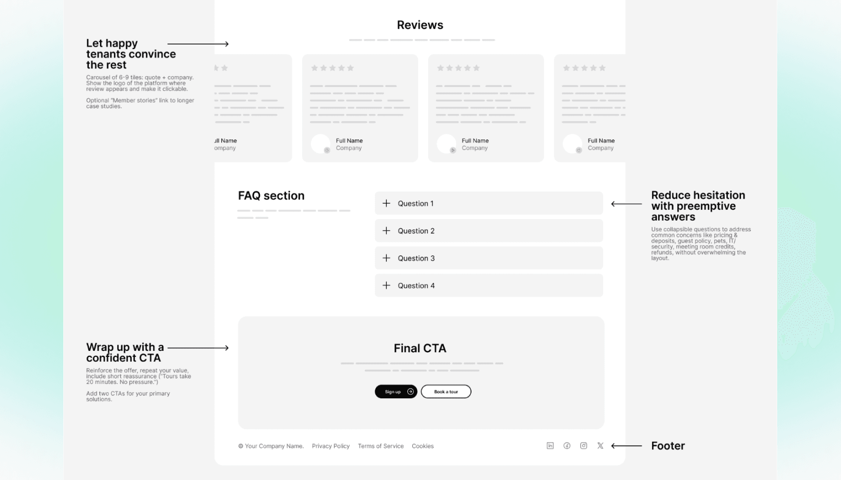
Keep a small trust strip in the hero—five or six customer logos or a short star rating—to establish credibility without crowding the screen.
Keep the visuals calm and optimize for download speed. On mobile, a clean photo of a real workspace beats a heavy video every time. Using a reliable website speed booster can further enhance loading performance, ensuring your site delivers a smooth and fast user experience across devices. Save the cinematic walk‑through for your tour confirmation email; the hero should load in a heartbeat.
Describe what you offer
Coworking operators sell a mix of experiences, but buyers only need to recognize the product they came for. Treat your offer like a menu that always reads the same way: Private Offices, Coworking (hot desk and dedicated desk), Meeting Rooms, Event Space, and Virtual Office.
If you have All‑Access or multi‑city passes, add them too. Each product section deserves a single sentence that explains what it is, who it’s for, and the immediate next step. That’s it.
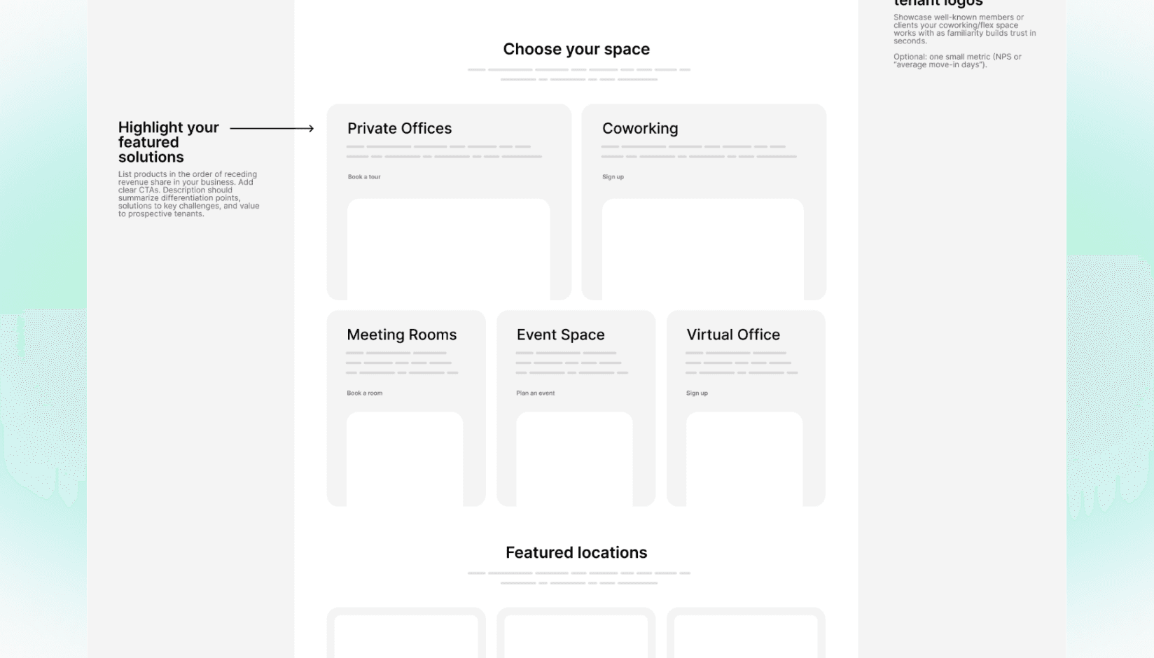
At-a-glance: Matching products to buyers
| Product | Ideal for | Recommended CTA | Pricing model |
|---|---|---|---|
| Private Offices | Teams, businesses | Book a Tour / Get a Quote | Show price ranges |
| Coworking | Freelancers, remote workers | Sign Up / Join Now | Show "from $X/mo" |
| Meeting Rooms | Individuals, external clients | Book a Room | Show clear hourly rates |
| Day Passes | Travelers, occasional users | Book a Desk | Show flat daily rate |
| Virtual Office | Startups, remote companies | Sign Up | Show monthly rates |
Publishing “from” prices for coworking and day passes usually helps—people just want a starting point. Offices and suites often work better with Get a Quote paired with clear ranges or “availability snapshots” on location pages.
These choices aren’t about secrecy; they’re about guiding different buying motions. A freelancer will happily buy a day pass at 11 p.m. on their phone. A team of fifteen wants to see a floor plan and a calendar link to tour tomorrow at 10.
Make meeting rooms and day passes truly bookable
This is where many websites quietly lose revenue. If users can’t see meeting room availability, they assume you’re not ready for their business. Also, you don’t want your sales executives waste time on handling $10 orders.
The pattern that converts is consistent: view room calendar with photos, amenities, and prices → pick a time → book.
Checkout should be short and trustworthy: card, Apple Pay, or Google Pay, instant confirmation, and a friendly email with arrival instructions, Wi‑Fi, and parking tips. This self-service journey can be easily handled by your coworking space management platform, so just integrate the link into the CTA.
Day passes follow the same logic. Choose a location and a date, pay, and receive clear details on access and what’s included. If you’re not ready to support every location with e‑commerce, start with one flagship site and expand. Even a single bookable location trains your audience to see your brand as easy to buy from.

Generate recurring revenue and offer exceptional customer experience at your shared or coworking space
Treat location pages like mini landing pages
Coworking or flex office location pages do most of the heavy lifting for both SEO and conversion. Think of each one as a self‑contained sales page: it should answer the practical questions a visitor would ask on a tour.
Start with a clear hero (“Coworking and private offices in [City/Neighborhood]”) and put the exact address right under it. Add a map that shows walking times to transit and parking, not just a pin. People choose locations as much for the neighborhood as the building; acknowledge that in a sentence or two.
Your gallery should be short and honest—eight to twelve photos—prioritizing meeting rooms, phone booths, a lounge or café shot, and an open workspace. You can also showcase how your workspace integrates modern meeting transcription tools to emphasize a tech-friendly and productivity-driven environment. If a space is still under construction, use renders sparingly and label them; pair with a timeline and a way to register early interest.
A good location page mentions availability in human terms. A small module that says “2–4 person offices available now” or “Suites for 10–20 desks—join the waitlist” helps visitors decide whether to act.
Right next to it, list the amenities with brief descriptors: Wi‑Fi speed, number of phone booths, wellness room, showers, bike storage. Avoid long icon farms that repeat the obvious; people care more about bandwidth and noise control than the tenth coffee icon.
Perhaps the most important element is a meeting rooms module that shows a date/time picker and loads real availability without leaving the page.
If you sell coworking passes at that location, keep a small “Buy day pass” area with what’s included. If the address supports Virtual Office, outline the packages and let people purchase without calling. Keep Book a Tour and Book a Room visible as the user scrolls; a simple sticky bar on mobile is enough.
Use copy that sounds like a person, not a policy
It’s tempting to write like a lease. Resist it. Focus on benefits and moments.
Instead of “We provide access to meeting rooms during business hours,” try “Meet clients in a quiet room with a screen and great coffee, even on short notice.”
Mention the things that actually sway a visitor: phone booths to take calls, reliable video conferencing, a host who knows regulars by name, daylight and plants if you have them. Keep sentences short. Avoid buzzwords. When you write the hero tagline, imagine you’re talking to someone on the sidewalk who just asked, “What is this place?” That question is the best filter for fluff.
Pricing that helps people decide
There’s constant debate about whether to publish prices. The middle path works best for early‑stage operators.
For Coworking and Day Passes, show your “from” price and what’s included. Remove the fear of hidden fees by listing the basics: credits, printing, guest policy.
For Private Offices and Suites, keep the CTA as Get a Quote, but pair it with context: “Most 4‑person offices are in the $X–$Y range depending on view and term.”
If you’re in a market where competitors are fully transparent, follow that norm; if not, provide ranges and learn your own close rates before publishing line‑by‑line detail.
Information architecture that search engines understand
A high‑performing coworking site doesn’t rely on a single page to do everything. It uses a simple structure that matches the way people search.
Core site structure
At the top level, keep the navigation clear: Find a Location, Offices, Coworking, Meeting Rooms, Event Space, Virtual Office, Resources, and Contact.
From there, create neighborhood pages that introduce your presence in each area, and then link down to location pages for each building. This helps you rank for “coworking in [Neighborhood]” and “meeting rooms in [Neighborhood]” without stuffing keywords where they don’t belong.
Content strategy for your blog
On the blog, answer real questions in plain language: the difference between a day pass and a membership, what to look for in a meeting room, whether virtual office addresses meet common registration requirements in your city, where to host a team offsite, how much coworking costs in your city.
Use question‑based subheads and put a straightforward answer in the first paragraph beneath each one. That format earns featured snippets and feeds AI overviews with concise facts instead of vague marketing lines.
Essential technical SEO
You don’t need to drown in technical SEO. Compress images, use reliable web hosting, and avoid heavy hero videos on mobile to keep load times fast. Add alt text that describes the image and its intent (“Meeting room with video conferencing in [City]”). Internal‑link where it helps a reader: product pages to city pages, city pages to locations, locations back to meeting rooms.
If your developer is comfortable, adding basic LocalBusiness and FAQPage schema is a plus, not a requirement.
Lead capture without the heavy hand
Pop-ups and aggressive full-screen modals can feel intrusive, especially for visitors who are seriously evaluating an office for their business. Instead, place your lead capture where user intent is naturally high and connect it to a resource that helps them make a decision.
On the homepage, just below your “Choose Your Space” section, offer something of immediate value, like an Office Move-In Checklist with tips for setting up a new workspace. This offer speaks directly to their current needs and positions your space as a helpful, informed partner. Keep the form short—name, email, and company size are enough to start the conversation without creating friction.
Yep, we have lead magnet too! Download the Coworking Website Template PDF.
Once someone requests this information, use the thank-you page to guide them toward the next logical step—book a tour, view meeting room availability, or get a quote.
This approach keeps your messaging relevant, nurtures trust, and gently moves potential members closer to committing, all without overwhelming them with irrelevant or generic offers.
Measurement first, then experiments
Even with a small site, you can learn quickly. Track clicks on Book a Tour, Book a Room, and Buy Day Pass, along with completion rates for room and pass checkout.
Enable Spacebring’s integrations with Meta Pixel and Google Analytics to optimize ad campaigns based on these conversion events. Watch how many tours are scheduled per hundred visitors and which devices convert. If you discover that mobile visitors outnumber desktop visitors but convert less, it is a clue to test your sticky CTA and form steps on smaller screens.
When you’re ready to experiment, keep it simple. Test variants of your home page hero and description. Turn “from” pricing on and off for coworking to see whether it affects tour requests. None of these tests require new photography or a redesign; they’re small changes with outsized learning value.
A week‑long plan to launch
If you’re still pre‑opening, you don’t need a giant build. In seven days, you can launch a site that looks polished and does the job. Ivana Katz, founder of Websites 4 Small Business, explains: “Rushing a coworking site live is fine, but don’t forget—the polish matters. Clients judge your brand by how easy it is to book a tour or a meeting room. A well-structured website can make the difference between an enquiry and a bounce.” Before you begin, ensure you have your domain name secured and pointing to your hosting provider.
- Start by drafting your copy using this article and our template as a guide, and choose a small set of photos that look like your real space. If you’re launching quickly without a full development cycle, an AI website builder can help you get a functional first version live before refining it with a designer or agency.
- Build the homepage and solution pages first, then a single city page and two complete location pages—even if one is “coming soon.”
- Connect meeting room and day pass booking to your member web portal for at least one location.
- Connect analytics and basic goals.
- On the last day, test the site on your phone: Are the CTAs always close at hand? Do the forms and checkout flow make sense to someone who’s half‑distracted on a train? If the answer is yes, go live. You can add more locations and posts as your opening date nears.
Why this approach works
Coworking is both a product and a service. People buy the room and they stay for the experience. The most effective websites respect both truths. They remove friction for simple, repeatable purchases like meeting rooms and day passes. They set proper expectations for complex decisions like offices and suites. They show enough of the space to make it feel real and enough of the neighborhood to make it feel convenient. And they sound like a human, not a policy manual.
When you present your brand this way—search first, dual CTAs, clean solution listings, rich location pages, clear pricing, and e‑commerce where it matters—you make a quiet promise: we’re easy to work with. That promise is what fills your calendar before you open.
Your high-converting website checklist
Key takeaways from this guide:
✓ Homepage: Use two main CTAs—one for high-commitment products (Book a Tour) and one for low-commitment products (Book a Room).
✓ Navigation: Structure your menu around user intent (Offices, Meeting Rooms, Coworking, etc.).
✓ E-Commerce: Make meeting rooms and day passes instantly bookable and payable online.
✓ Location pages: Treat each location page as its own sales page, complete with address, map, photos, and amenities.
✓ Pricing: Show starting prices for simple products and offer quotes or ranges for complex office solutions.
✓ Copy: Write in a clear, human voice that focuses on benefits, not just features.
✓ Analytics: Track conversion events (tours booked, passes sold) to measure what's working.
Put it to work today
We took all of these ideas and compressed them into a one‑page Coworking Home Page Template you can share with your designer. It includes the full home page layout with sample headlines and recommended CTAs. It’s free, and it’s the fastest way to turn this article into a real site.
Download the template (PDF)
If you’d like feedback on your draft, contact us. The Spacebring team routinely reviews new coworking space websites every week and we’re happy to share quick, practical notes.